

Table of contents
Introduction
In this blog, We will see the Flexbox layout model in CSS. This will include the basics of Flexbox. Why and how we can use them. We will go step by step starting with the basic concepts like the main axis, main-start | main-end, main size, cross axis, cross-start | cross-end, and cross size. Then we will cover concepts of Flexbox properties like display, flex-direction, order, flex-wrap, flex-flow, flex-grow, flex-shrink, justify-content, align-self, and align-items.
What is Flexbox?
Flexbox is a CSS layout model that allows developers to create flexible and responsive layouts without relying on floats, positioning, or other hacks which use to be a tidious for developers back then. Flexbox is based on a container and its child elements, which can be arranged in any direction and can be easily resized and repositioned based on the available space. It is designed to make it easy to align and distribute elements within a container, regardless of their size or content.
In short, a Flexbox is a one-dimension method for laying out items in rows and columns. It can also be represented as -->> FlexBox = Flexible + Box
Basics and terminology - Flexbox Axis:
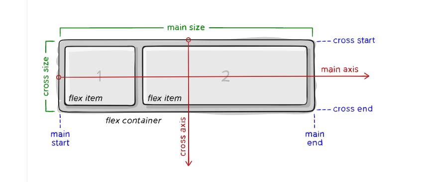
Items will be laid out following either the main axis (from main-start to main-end) or the cross axis (from cross-start to cross-end).
main axis – The main axis of a flex container is the primary axis along which flex items are laid out. Beware, it is defaulter and can be changed using the flex-direction property.
main-start | main-end – The flex items are placed within the container starting from main-start and going to main-end.
main size – A flex item’s width or height, whichever is in the main dimension, is the item’s main size. The flex item’s main size property is either the ‘width’ or ‘height’ property, whichever is in the main dimension.
cross axis – The axis perpendicular to the main axis is called the cross axis. Its direction depends on the main axis direction.
cross-start | cross-end – Flex lines are filled with items and placed into the container starting on the cross-start side of the flex container and going toward the cross-end side.
cross size – The width or height of a flex item, whichever is in the cross dimension, is the item’s cross size. The cross size property is whichever of ‘width’ or ‘height’ that is in the cross dimension.
How to initialize the flexbox ?
To get started we can start with we need to make container sort of thing which will carry items in them and it will coded in html file -->>
<body>
    <div class="section">
        <div class="box" id="box-1"> First box  </div>
        <div class="box" id="box-2"> Second box </div>
        <div class="box" id="box-3"> Third box  </div>
        <div class="box" id="box-4"> Fourth box </div>
    </div>
</body>
Then in CSS we can initialize with it with propery(flex container) -->>
.section {
  display: flex;
}
What are the Flexbox properties ?
display :
- This property sets the display type of the element to flex, which enables the flexbox layout model (The code for the same is written above).
flex-direction :
- Property sets how flex items are placed in the flex container defining the main axis and the direction (row or column).
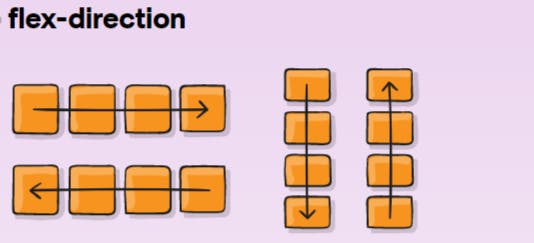
As shown in image above, this is how all the Boxes(items) will appear when you will use flex-direction properties like:
row: This is the default value, and it creates a horizontal Flexbox container where the main axis runs from left to right.
row-reverse: This value creates a horizontal Flexbox container where the main axis runs from right to left.
column: This value creates a vertical Flexbox container where the main axis runs from top to bottom.
column-reverse: This value creates a vertical Flexbox container where the main axis runs from bottom to top.
.section {
  flex-direction: row | row-reverse | column | column-reverse;
}
order :
By default, flex items are laid out in the source order. However, the order property controls the order in which they appear in the flex container.
#box-1 {
  order: 5;
}
fex-wrap :
Determines whether Flex items should be forced to wrap onto multiple lines or remain on a single line. The flex-wrap property is used on the Flex container and has three possible values:
nowrap(default): all flex items will be on one linewrap: flex items will wrap onto multiple lines, from top to bottom.wrap-reverse: flex items will wrap onto multiple lines from bottom to top.
.section {
  flex-wrap: nowrap | wrap | wrap-reverse;
}
flex-flow :
This is a shorthand for the flex-direction and flex-wrap properties, which together define the flex container’s main and cross axes. The default value is row nowrap.
ex -
.section {
  flex-flow: column wrap;
}
justify-content :
The justify-content property aligns the Flex items along the main axis of the container. There are five possible values for the justify-content property:
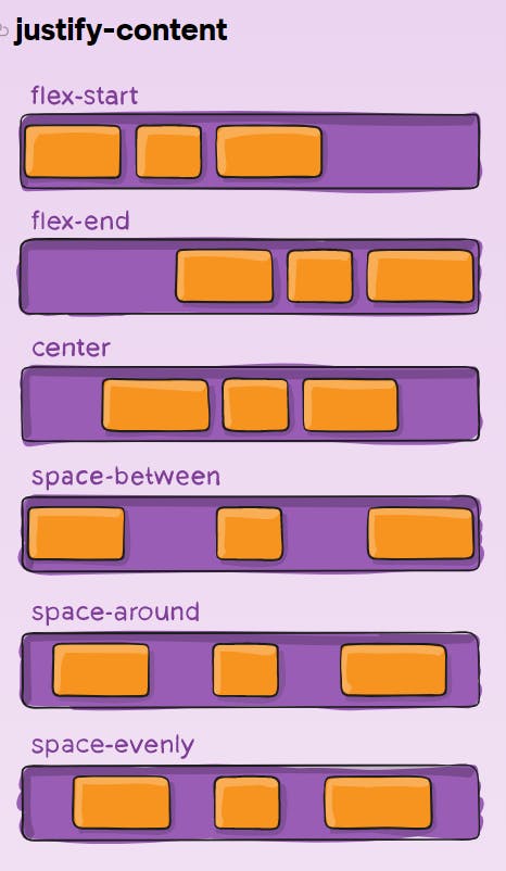
flex-start(default): items are packed toward the start of the flex-direction.flex-end: items are packed toward the end of the flex-direction.center: items are centered along the linespace-between: items are evenly distributed in the line; first item is on the start line, last item on the end linespace-around: items are evenly distributed in the line with equal space around them. Note that visually the spaces aren’t equal, since all the items have equal space on both sides. The first item will have one unit of space against the container edge, but two units of space between the next item because that next item has its own spacing that applies.space-evenly: items are distributed so that the spacing between any two items (and the space to the edges) is equal..container { justify-content: flex-start | flex-end | center | space-between | space-around | space-evenly;
flex-grow :
property that controls how much an individual Flex item should grow in relation to its siblings. It takes a unitless value that represents the proportion of available space the item should take up. A higher value means the item will take up more available space than its siblings.
#box-1 {
  flex-grow: 4;
}
flex-shrink :
In the very same way as of flex-grow, here it defines the ability for a flex item to shrink if necessary.
#box-1 {
  flex-shrink: 3;
}
align-items :
property used to control the vertical alignment of Flex items within a Flex container. It aligns the items along the cross axis of the container. The align-items property has five possible values:
.section {
  align-items: stretch | flex-start | flex-end | center | baseline;
stretch(default): stretch to fill the container (still respect min-width/max-width)flex-start: items are placed at the start of the cross axis. The difference between these is subtle, and is about respecting theflex-directionrules or thewriting-moderules.flex-end: items are placed at the end of the cross axis. The difference again is subtle and is about respectingflex-directionrules vs.writing-moderules.center: items are centered in the cross-axisbaseline: items are aligned such as their baselines align
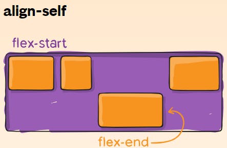
align-self:This allows the default alignment (or the one specified by
align-items) to be overridden for individual flex items. It is having all the similar properties as ofalign-items.
#box-1 {
  align-self: flex-start | flex-end | center | baseline | stretch;
}
Conclusion :
CSS Flexbox is a powerful layout model that allows you to create dynamic and responsive layouts for your web projects. Whether you're building a simple navigation menu or a complex grid system, CSS Flexbox provides a versatile toolset for creating layouts that adapt to different screen sizes and devices, improving the user experience for your website visitors.
"Let's stay in touch."
Twitter: Click here
Github: Click here
LinkedIn: Click here
Email: Click here
At the end I would like to say that, Expanding your network can be incredibly valuable both personally and professionally. If you're interested in connecting, feel free to reach out and introduce yourself. I look forward to the possibility of building a new relationship.
Thank you for taking the time to read this!